A different Ragtime revival logo

| 7 Comments
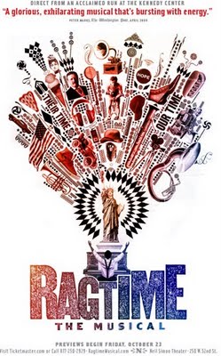
Back in September, the NYTimes posted a feature on the ad campaign evolution for this year's Ragtime Revival. I was looking at it today and found this aborted design:

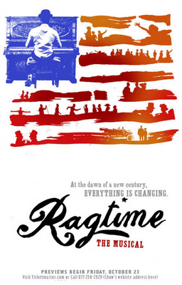
Am I the only one who likes it much better than the one they ended up going with?

7 Comments

apparently. the flag one looks generic.
No, I like the first one better, too. The one they used looks too cartoony for my taste.
You are so not alone! I totally prefer this artwork to the one they settled on.
You are so not alone:

http://everythingmusicals.com/everything_i_know_i_learn/2009/08/desk-clearing-west-side-story-bye-bye-birdie-and-the-nine-movie.html
It's not even that I like the alternate so much, it's more that I dislike this one and thought the alternate would have been a better choice of the group.
Definitely agree with you. The first one is so much better, simpler and more elegant. And I'm pretty lukewarm about the revival itself.
The taglines in both versions are crappy.
~ Megan

Leave a comment


ITBA

RECENT BLOG ENTRIES

Yay Jeff Hiller.
Million Dollar Password - watch more funny videos…
State of the Art
And to be honest, it's a lot less depressing than 2010.  It's a little more like 2009, really. Addams FamilyAnything GoesBilly ElliotBonnie…
For all the times I've misspelled it when typing a URL...
This made me kind of happy:In case they haven't fixed it yet by the time you see this, link: http://www.variety.com/article/VR1118047264?refCatId=15…
Album Logos, Separated By Birth
Am I the only one who saw this: and thought maybe Spring Awakening had been re-released in an acoustic version?…

RECENT COMMENTS

BROADWAY ABRIDGED LIVE! (THE CD)


Volume 1: Even More Musicals comedy album available for sale on iTunes/Amazon.